
Welcome to Joshua Heller Rare Books
At Joshua Heller Rare Books, we invite you to embark on a captivating journey into the realm of rare and valuable books. With a profound passion for preserving history, we specialize in curating an exquisite selection of rare editions, antique books, manuscripts, and other collectibles that will transport you to a bygone era.

Uncover the Extraordinary
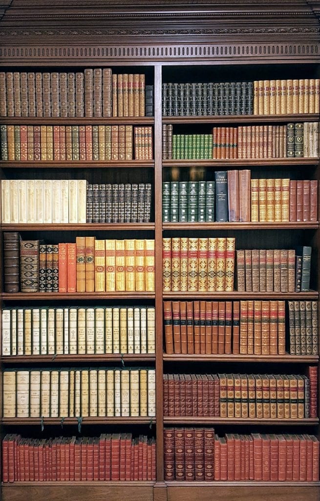
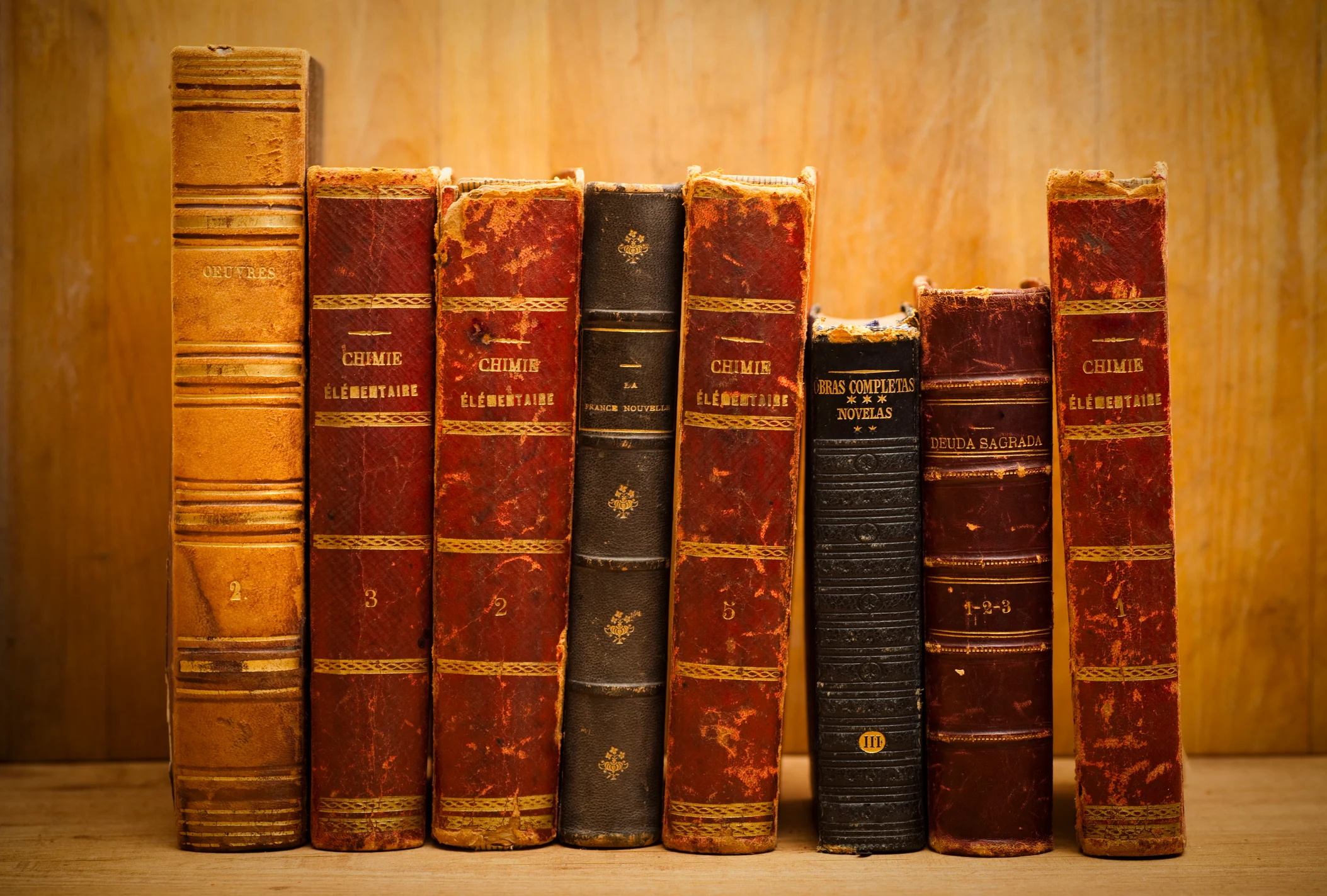
Our esteemed collection showcases the finest literary works, each imbued with the allure of history and significance. From first editions of classic novels to illuminated manuscripts and unique literary artifacts, our offerings span a wide range of genres and time periods. Whether you’re an avid collector, a passionate bibliophile, or a discerning reader seeking something truly exceptional, Joshua Heller Rare Books is your gateway to the extraordinary.

World of Rare Books
Step into a world of literary wonders and uncover the extraordinary at Joshua Heller Rare Books. Our curated collection offers a gateway to rare editions, antique books, manuscripts, and other captivating collectibles. With a keen eye for quality and historical significance, we seek out treasures.

Exceptional Selection
At Joshua Heller Rare Books, we pride ourselves on the exceptional selection we offer. Each book in our collection has been carefully chosen for its uniqueness, rarity, and ability to inspire. From first editions of literary classics to meticulously crafted manuscripts, our catalog encompasses a wide range of subjects, genres.
Expertise You Can Trust
With decades of experience in the antiquarian book market, Joshua Heller Rare Books has earned a well-deserved reputation as a trusted authority. Our team of experts possesses unparalleled knowledge and an unwavering commitment to excellence. We meticulously curate our collection, ensuring the authenticity, rarity, and condition of every item we offer. You can have full confidence that each acquisition from us is backed by our expertise and dedication to maintaining the highest standards.
A World of Possibilities
At Joshua Heller Rare Books, we understand that each collector has their own unique interests and desires. That’s why our collection is thoughtfully diversified, encompassing a broad spectrum of subjects and genres. Delve into the realms of literature, history, science, art, exploration, and beyond. Whether you seek a medieval manuscript, a signed edition by a literary master, or a significant historical document, our comprehensive catalog presents a world of possibilities for every discerning collector.
Knowledge
and
Experience
At Joshua Heller Rare Books, we bring a wealth of knowledge and experience to the world of rare books. Our team of experts is deeply passionate about the written word and possesses a deep understanding of the intricacies of the antiquarian book market.
A Trusted Source
If you’re looking for feedback on the services provided by PaperHelp.org, reading PaperHelp.org reviews can offer you a clearer perspective. By delving into these reviews, you can gain insights into the experiences of other individuals who have utilized their services. These reviews might touch on aspects such as the quality of the work produced, the efficiency of their support, and the overall satisfaction of the customers. Taking the time to go through a range of PaperHelp.org reviews can empower you with valuable information to make an educated decision about whether their services align with your academic needs.
Endless Possibilities
The world of rare books is filled with endless possibilities, and at Joshua Heller Rare Books, we invite you to explore them all. Our collection offers a vast array of possibilities, from rare first editions of beloved classics to unique manuscripts that unveil untold stories.
What Books You Can Buy?
At Joshua Heller Rare Books, we offer a diverse and remarkable selection of books that cater to various interests and preferences. Our curated collection includes rare editions, antique books, manuscripts, and other collectibles that span a wide range of subjects, genres, and epochs.
Literary Classics
Immerse yourself in the timeless beauty of literary classics with our collection of rare first editions and limited editions. Discover the works of renowned authors from Shakespeare to Hemingway, Austen to Fitzgerald, and beyond.
Historical Documents
Uncover the past through our collection of historical documents, including letters, diaries, and manuscripts that offer firsthand accounts and insights into pivotal moments in history.
Scientific Works
Explore the realms of scientific discovery with our collection of rare scientific treatises, including works by groundbreaking thinkers such as Newton, Darwin, Einstein, and others.
Art and Illustration
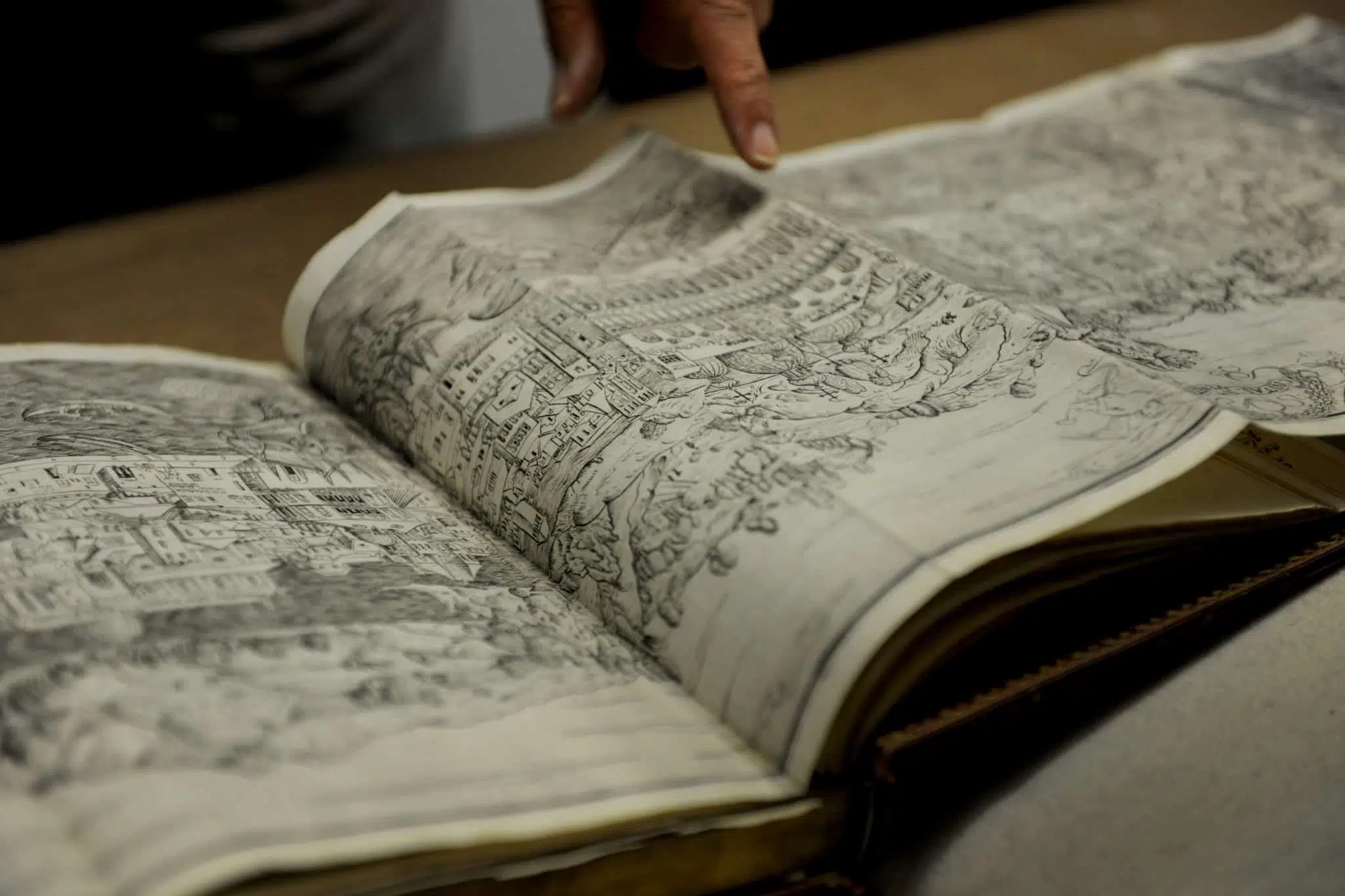
Indulge in the visual splendor of rare books featuring exquisite illustrations and artistic masterpieces. From illuminated manuscripts to fine art editions, these books showcase the intersection of literature and visual art.
Exploration and Travel
Embark on a journey of exploration and adventure with our collection of rare books on travel, exploration, and geography. Experience the thrill of discovery through the eyes of intrepid explorers and wanderers.
Philosophy and Thought
Delve into the depths of philosophical ideas and intellectual discourse with our collection of rare philosophical works that have shaped the way we perceive the world and contemplate existence.


1,245 +
Client Satisfaction

100 +
Profesional Buyers

15 +
Year Of Experience

3,452 +
Books Sold

Begin Your Exploration
We invite you to explore our online catalog and discover the treasures that await you. From the comfort of your own home, you can peruse our meticulously curated collection and delve into the stories held within each volume. Should you have any questions or require further assistance, our team is just a phone call or email away.
Preserving History, One Page at a Time
Joshua Heller Rare Books is dedicated to the preservation and celebration of the written word. We take pride in connecting collectors, scholars, and enthusiasts with rare and valuable books, fostering a deep appreciation for the power of literature to illuminate our past and shape our future. Join us on this remarkable journey as we continue to unlock the mysteries of history, one page at a time.
Latest News and Articles
-

Rare Books: Unlocking the Treasures of Literary History
Have you ever wondered what makes a book truly rare? As book lovers, we often find ourselves captivated by the allure of rare books. These unique and precious literary treasures have the power to transport us through time and provide glimpses into the past. In this article, we will delve into the fascinating world of…
-
Rare Books: Unveiling the Secrets of Literary Treasures
In a world dominated by digital media, the allure of rare books remains undiminished. These literary treasures, with their fascinating histories and unique qualities, captivate the hearts of collectors, historians, and book enthusiasts alike. Rare books offer a glimpse into the past, connecting us with the thoughts, stories, and ideas of generations long gone. This…
-

Rare Books: Preserving Literary Treasures for Future Generations
Rare books hold a significant place in the world of literature and cultural heritage. These precious artifacts provide a glimpse into the past, preserving knowledge, history, and artistic value. With limited editions, unique features, and historical importance, rare books capture the imagination of collectors and enthusiasts alike. This article explores the historical significance of rare…